How-ToThe appMade with Zelos app 26.0.9
Pick the right panel for each signal
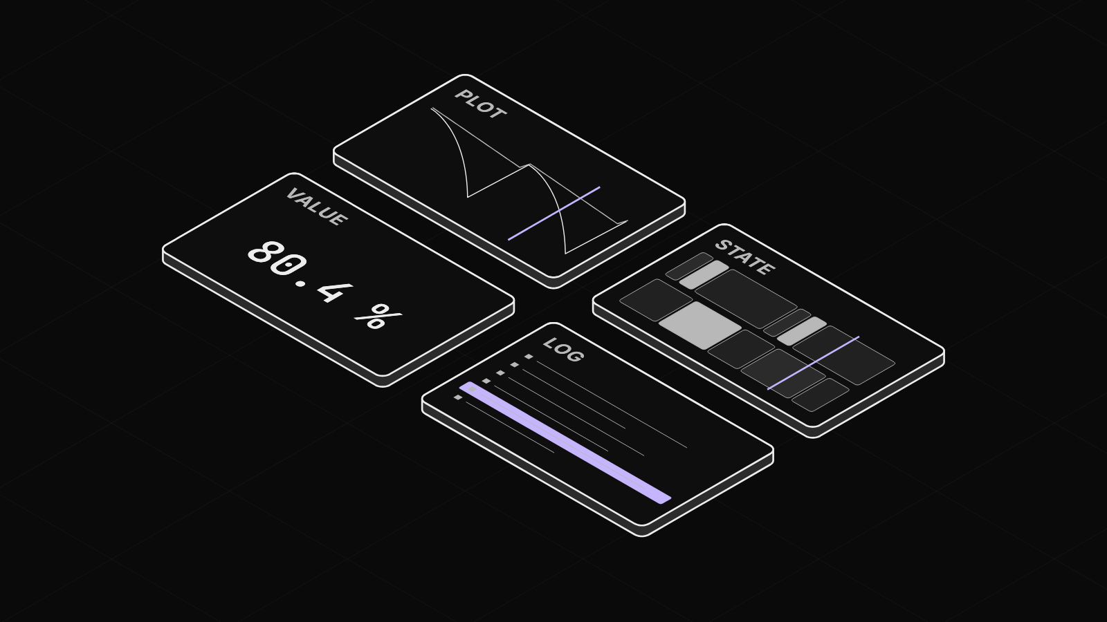
Choose a panel by the shape of the signal: a plot for a value that moves, state bands for a value that holds, a large readout, or a log.
Contents9 sections
Every panel in a tab follows the same timeline. This guide picks a panel for each signal of a simulated battery pack, by the shape of the signal.
This guide runs on simulated data. Install the CLI shows how to start it.
Match the panel to the signal's shape
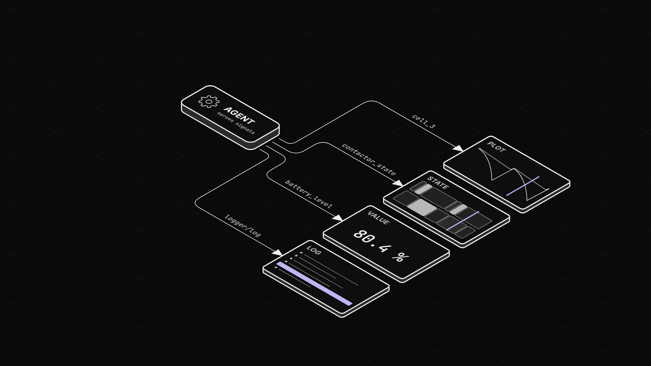
A panel is one view of some signals inside a tab. One signal can appear in several panels, and all panels in a tab share one cursor. Pick the panel by the shape of the signal. A value that moves goes in a Plot, and a value that holds goes in a State panel. A number you read at a glance goes in a Value panel, and text goes in a Log panel.
These are the panels you use most:
| Panel | Use it for |
|---|---|
| Plot | A value that moves, drawn against time. |
| Table | The value of each signal at the cursor, one row per signal. Use it to compare signals at one moment. |
| Raw | Every record, one row per sample. Use it to check what was actually sent. |
| State | A value that holds, such as a contactor state, drawn as bands. |
| Value | One reading, large, at the cursor. |
| Log | Text messages, with a level. |
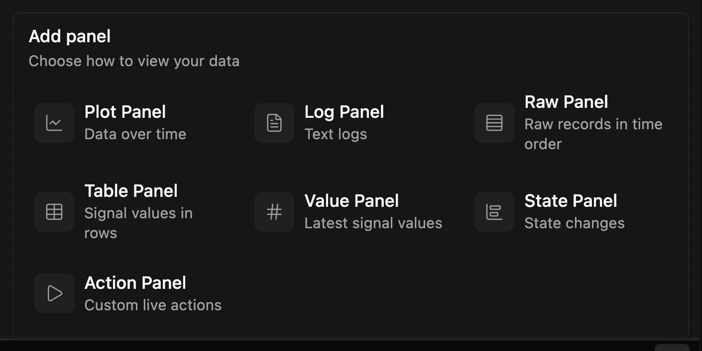
Add panel lists every kind, each with a one-line description. The panels docs cover each one.
Before you start
- The Zelos app.
- A live workspace with an empty tab, as in Find your way around the app.
Step 1: Plot a cell voltage
Click the magnifier at the top of Explorer, type cells, and expand the cells event. Drag cell_0 into the empty tab, and a Plot opens with it. Drop cell_3 on the plot for a second line. For other panels, start from Add panel, at the right end of the timeline bar.

Step 2: Show one event in a Table and a Raw panel
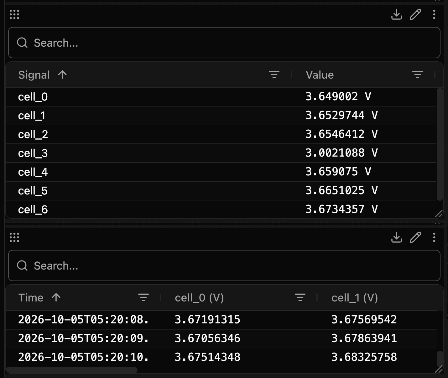
Add a Table Panel and drag the whole cells event onto it. The Table shows one row per cell, with the value at the cursor, or the latest value while live. Add a Raw Panel and drop the same event. The Raw panel shows every record in time order, with a Time column and one column per field.
Step 3: Show values that hold as State bands
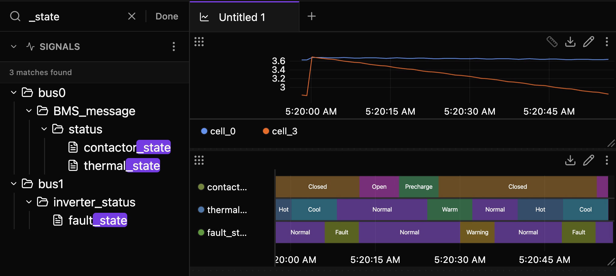
Search for _state to find contactor_state, thermal_state and the inverter's fault_state. Add a State Panel and drag the three in. Each becomes a lane of colored bands, one per stretch of the same value.
Step 4: Show a reading as a Value
Add a Value Panel and drag in battery_level and pack_current. Each gets one large readout with its unit.
Step 5: Drop the log event
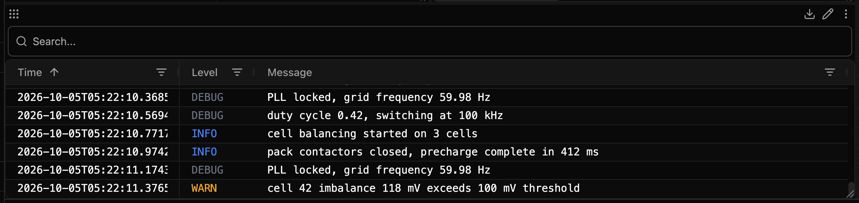
Search for logger, expand it, and drag the whole log event into empty space below the panels. A Log panel opens by itself, with Time, Level and Message columns.
The finished tab
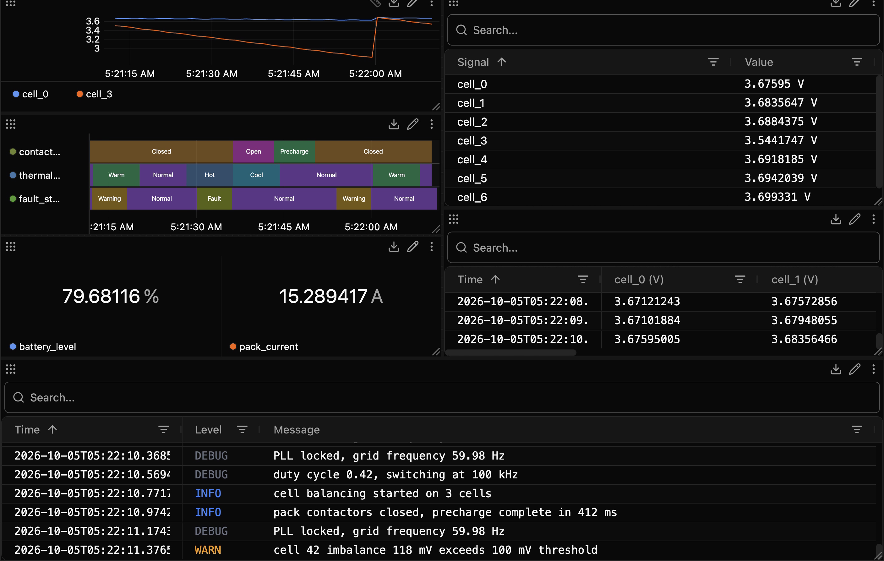
Drag a panel by its header to move it, and by its lower-right corner to resize it.
Next: pause on a moment
Pause the timeline and read every cell in the Table at that instant. Pause live data, measure a change, and compare two runs covers the timeline every panel follows, and Build a view once and reuse it on every run keeps this tab.